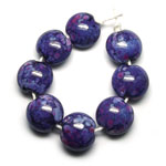
Messy Color™ Lapis
511531 -

|
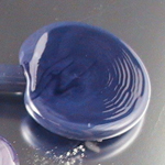
An opaque deep blue violet.
Click here to view
Lapis
Uniques
|
|
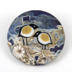
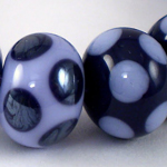
Lapis with Val Cox 'Purple Rose' frit. See more of Laura's eye candy. – Laura Sparling Click here for other interesting Lapis discoveries.
|
CiM Tester Feedback
-
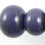
Lapis is a unique addition to the 104 lampworking palette.
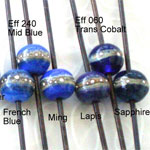
"I swear it's like an opaque ink blue. A deep purple blue. It's not as blue as the effetre Lapis which is more cobalty.” – Kevan Aponte
“Lapis is a very dark purple blue. There really isn't much comparison in the Moretti palette.” – Genea Crivello
“I really love this deep dark purple. If I could make an opaque version of dark ink blue it would look just like this! There hasn’t been any opaque purple this dark, so it’s a great addition to my palette.” – Gail Witt
“It can get really dark – almost black after working it for awhile.” – Chris Molter
"It’s quite dark, which presents a design challenge for me. I find the darker colors harder to work with. This is a glass I would use as frit, more than rod." – Terri Budrow-Nelson
“It is not so dark that it looks black, but is a really dark purple." – Gail Witt
-
Some testers reported a metallic sheen when reducing Lapis.
"I would compare Messy Lapis to Moretti’s hand pulled dark silver plum. It reacts much the same way as the dark silver plum in reduction but is more blue, and is not overpowered by the ‘reduced silver surface' that the silver plum gets in reduction. Though I love dark silver plum, I am sometimes disappointed that the reduction overpowers the color so heavily. I love Lapis’ ability to get the silvered reduction surface while still retaining its rich blue/indigo color!" – Bonnie Polinski
“I tried reducing it – I found no difference." – Chris Molter
"I did reduce the glass on a small bead, but didn’t see a lot of change." – Gail Witt
"If worked long, or reduced, a silver sheen comes out." – Elasia
-
Some testers suggested that Lapis should be in the purple category instead of blue.
"I think this is one of those colors that you should put under both the blue AND the purple, because it really does go both ways. It's the perfect color to depict a dark night sky with." – Bethany Lemasters
-
Special thanks to Genea Crivello-Knable, Elasia, Vonna Maslanka, Claire Morris, & Bethany Lemasters for providing the photos in this section.
Join Trudi Doherty's FB group Lampwork Colour Resource Sharing Information for a catalogue of color study.
Claudia Eidenbenz’s "Vetrothek" (glass library) is a great resource for color comparisons.
See Kay Powell’s frit testing samples.
Browse Serena Thomas’ color gallery.
Check out Miriam Steger’s CiM color charts.
Consult Jolene Wolfe's glass testing resource page.
"Lapis is hands-down the best blue-purple opaque colour I've yet used. It is interestingly reactive, vibrant, and relatively inexpensive [compared to other purples and indigos] to boot." Read more at Melanie's blog. |
|
"I love that Lapis is a wonderful deep blue violet that doesn't silver!"
– Genea Crivello
|
|
Learn how to make Lapis and Peace murrini with Kaz Baildon’s tutorial in the October 2013 issue of the Soda Lime Times. |
|
| Check out Claudia's sandpipers tutorial in her book Glass Bead Trip- here with Messy Lapis. |
"The main colourway for Sea Heather Mini Mo is CiM Lapis and Effetre Dark Turquoise, two of my absolute favourite glass colours." Read more at Kitzbitz Art Glass' blog. |
|
| "CiM Lapis is a dark opaque blue-purple. It is a lovely and well-behaved colour and I added it to my colour collection pretty quickly. I made some test beads here." Read more at Heather's blog. |
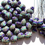
"I made a bead with part Lapis and part Kryptonite then streaked DH Triton over both colours. I superheated the bead until all the colours blended together then reduced and encased. The resulting silver streaking and pearly sheen are fabulous!"
– Julie Fountain
|
|
| “Eight beads in CiM's Glacier opaque with CiM's Lapis dots and the other eight with the opposing combination. The Lapis created a slight metallic finish when these beads emerged from the kiln and have a nice rich glow to them.” Read more at Darlene’s blog. |
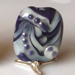
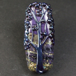
"I love Lapis, it is one of my favourite lampworking glasses of all time. It is easy to work with, not shocky and is an utterly divine colour. It is a stunning purple, I am not sure why it is called Lapis as it isn't blue but a yummy purple. I'd call it a regal purple. Lapis is a misleading name and doesn't do it justice. The tree bead is Lapis with silver foil, Hades, and DH Psyche."
– Claire Morris
|
|
| "The Lapis is darker and more purple than the colour that I usually think of when I think of Lapis - which is more like the Moretti Lapis. There is too much red in this colour to evoke the coloured gemstone of antiquity. But it's a nice colour and would add well to a sophisticated earthtone palette." Read more at DragonJools blog. |
"Lapis has been one of my favourite glasses for a long time, but I've never thought to etch it before - I love how it's turned out." Read more and see more comparison beads including etched versions at Lush Blogs. |
|